
I had my doubts about iOS 7 when I first started seeing the screenshots for it, but I did go ahead and take the plunge and install it on both of my iThings this past week: my iPhone 5, and my iPad 2. And on the whole, I gotta admit, it grew on me pretty quickly.
Design
First, the things I like.
Once I got used to the new design, I really appreciated that it’s less cluttered. I didn’t like the various screenshots I was seeing of super-bright, super-flat backgrounds with all the candy-colored icons in front of them. But once I set the devices up and chose some of the darker, less gaudy backgrounds, everything looked fine. (Pro tip: the white text labels on the various icons are a lot easier to read if you do in fact choose a darker background.)
I also like how a lot more of the UI is oriented around text now rather than inexplicable buttons. (Although I also am cognizant of the localization challenge, there!)
Definitely liking that I’m finally able to stuff several of the icons for standard iOS apps I never use (e.g., Stocks, FaceTime, Newsstand, and such) into a folder so I can just forget about ’em, and clean up some real estate space on my home screen. Also finally able to put more than twelve icons into one folder. YAY! This is helpful for my folders for games. And I do like the pagination of said folders, though this’ll mean I gotta remember to move the more important icons in a folder forward so I don’t forget about ’em.)
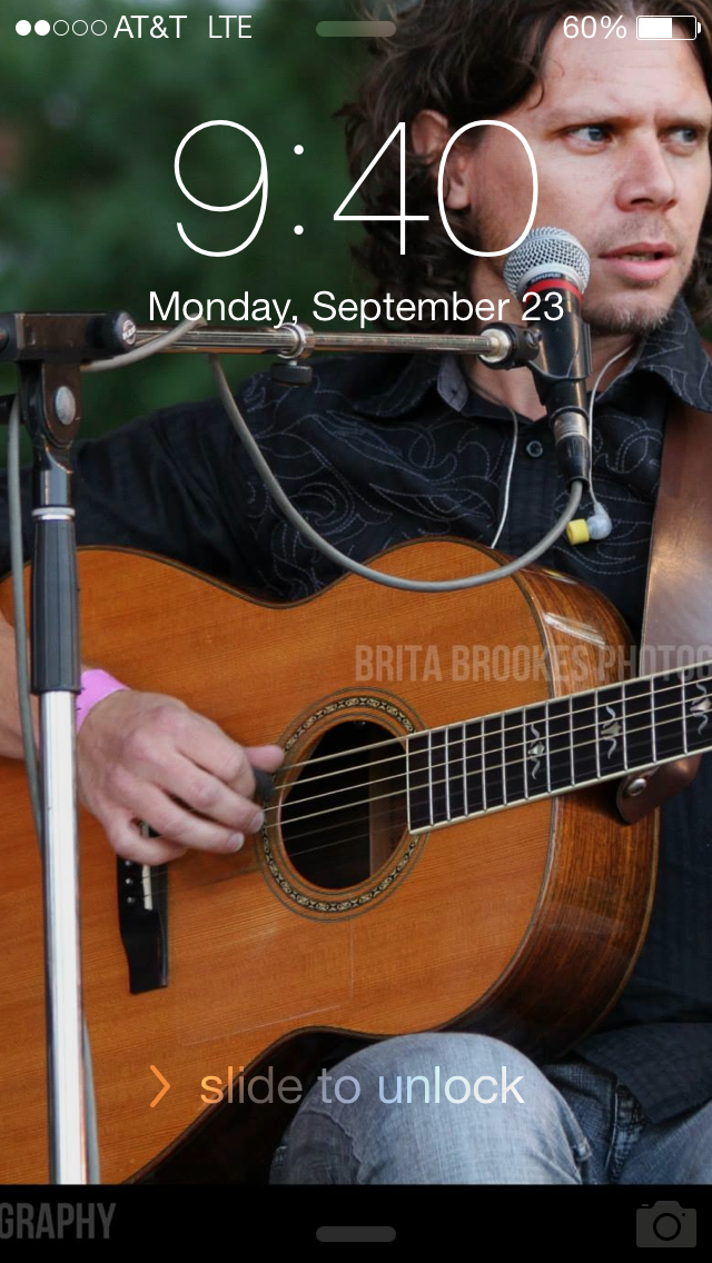
Quebecois Guitarists are an Important UI Element
The new layout of the lock screen, particularly on a device with a Retina screen like my iPhone 5, is nice–but it meant that the previous pic I was using of myself and Eric Beaudry of De Temps Antan was suddenly unacceptably fuzzy. OH DARN, I said, WHATEVER SHALL I DO IF ONLY I HAD A CACHE OF SUITABLE ALTERNATE HIGH RES PICS oh wait I DO.
And now, the things I don’t like:
Not a fan of the animations of swooping in and out when you unlock the device or when you’re switching back to the home screen. It actually makes me a little motion sick on my phone, though it’s not as bad on the iPad–possibly because there’s more screen to play with, I dunno. After a few days of having the OS on my devices, as I suspected, I am getting accustomed to the motion of app switching. Still though, given my druthers, I’d turn that off.
Also don’t like that the “Reduce motion” setting, buried under Accessibility, does not in fact reduce the animations. There’s no way to turn those off, as near as I can tell. That said, I did in fact turn that setting on because I’m also not a fan of the parallax of the backgrounds. See previous commentary re: don’t really need my phone making me motion sick, mmkay?
ETA: OH YES, I forgot to mention another thing about the parallax–apparently if you have parallax on, it impacts how you can center whatever photos you may be using on your lock screen. I noticed this on my iPad, where I’m using a photo I took of my signed Le Vent du Nord poster as my lock screen photo, and the centering of it went off once iOS 7 was installed. This problem went away once I turned on “Reduce motion”.
You can find this setting under Settings > General > Accessibility > Reduce Motion.
Functionality
And now that I’ve talked about what the OS looks like, here’s what I like about what it does.
I’m really digging the new task switcher. It’s a lot more elegant, and it’s super-easy to get rid of a task just by swiping upward on it.
The new “Today” screen is very nice. Its arrangement is intuitive and the info it shows is useful, particularly the new layout of notifications.
I haven’t had a reason to find the new control center useful yet, but I’m suspecting I will. Particularly the next time Dara and I go to Canada, at which point quick access to turning wifi off and on will be nice.
They actually didn’t break my Not Recently Played playlist this time. Well done there, Apple. I’ve complained before about this–though to be fair, when they’ve broken this before, it’s seemed like it’s always been variants of the same bug, i.e., if you try to use a “Limit” criteria on a playlist. My “Not Recently Played” playlist was previously trying to limit to 200 or 300 songs depending on how long I felt like making it. And since I turned off that criterion on the list some time ago, I honestly don’t know if the bug with it is still in there.
So far the things I don’t like are few. I’m vaguely miffed that they moved podcasts out of the Music app and off into their own thing. Presumably to free up real estate for iTunes Radio, about which I give exactly zero damns since I never use Pandora or Spotify–if I like music, I’m just going to buy it, and if I’ve bought it, chances are it’s already on my phone anyway.
And, while they haven’t managed to break my Not Recently Played smart playlist this time around as has happened on previous major revs of the OS, I did notice that there’s a visual bug involving showing the wrong album art for several of my smart playlists in general.
My personal jury is still out on whether they’ve managed to make the Maps app suck less. I did give it a test run to see how well it’d handle live walking directions, on a walk that took me about an hour. I did follow its directions successfully, but I also noticed lag time several times in how fast the phone caught up with my position along the route. More than once it gave me a spoken direction after I’d actually passed the spot in question.
Other Stuff
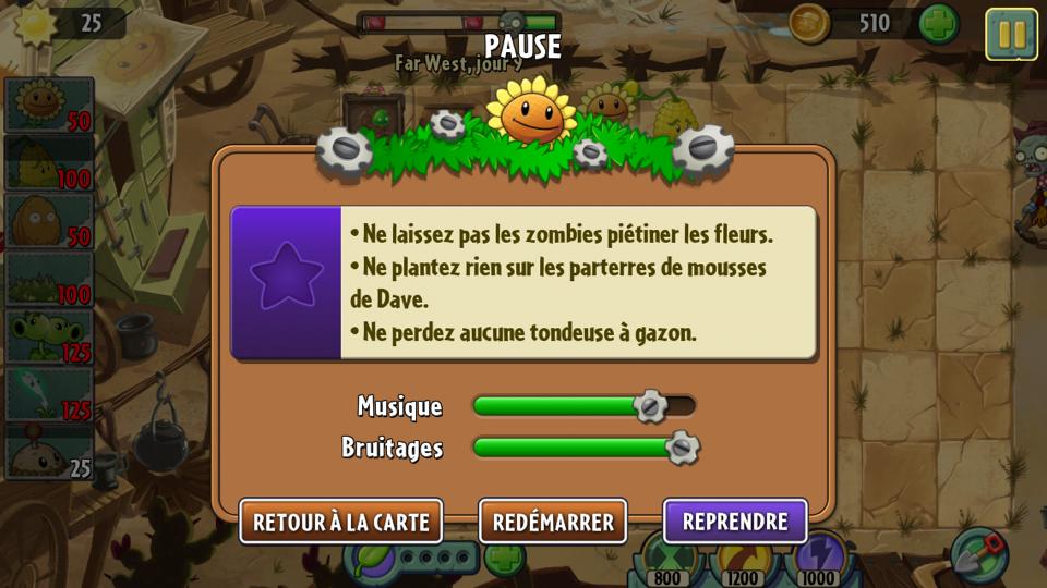
Plantes contre Zombies
And file this under category “never tried this in a prior version of the OS, but discovered it playing around with iOS 7 and thought it was cool”–just to see what would happen, I changed my phone’s language setting to French, and quite liked that you could do that on the fly. But what tickled me even more was seeing that both versions of Plants Vs. Zombies actually dynamically changed over to French, too!
What ultimately sold me on installing the OS on my devices were a couple of in-depth reviews, here and here–but also, just hearing from Dara and Paul that they were having positive reactions to it installing it on their devices at home. If you’re thinking about going for it, do go ahead and read the reviews first, so you can get an informed idea of what you’re signing up for.
Also, two other things I’ll mention that you’ll want to keep an eye out for. One is that there’s a potential vulnerability with the aforementioned lock screen, described here. I was able to reproduce the behavior it describes, though it does require you to be very quick to make it happen. On the other hand, I also noticed that I could not actually get to any applications in my task switcher which were not themselves accessible by the control panel. For example, I couldn’t get to either my Facebook app OR Echofon (the app I use for Twitter). So be on the lookout for this, be cognizant of what apps you’re running, and if you’re feeling paranoid about this particular thing, you might consider disabling the control panel.
The second thing I’ll mention is that if you’re concerned about privacy settings, go read this article about the various things you’ll want to make sure are OFF. In particular, eh, no, Apple, you really don’t need to know what places I commonly go to in my life.
TL;DR version
On the whole, I’m considering this a win, and certainly a less painful transition than going from iOS 5 to iOS 6 was. On the other hand, I’ve also got a reasonably new phone, and I wouldn’t recommend trying to install this on an older one. My iPad 2 does appear to be handling it well, though.
Drop me your thoughts in the comments on how the upgrade’s working for you!